The Challenge
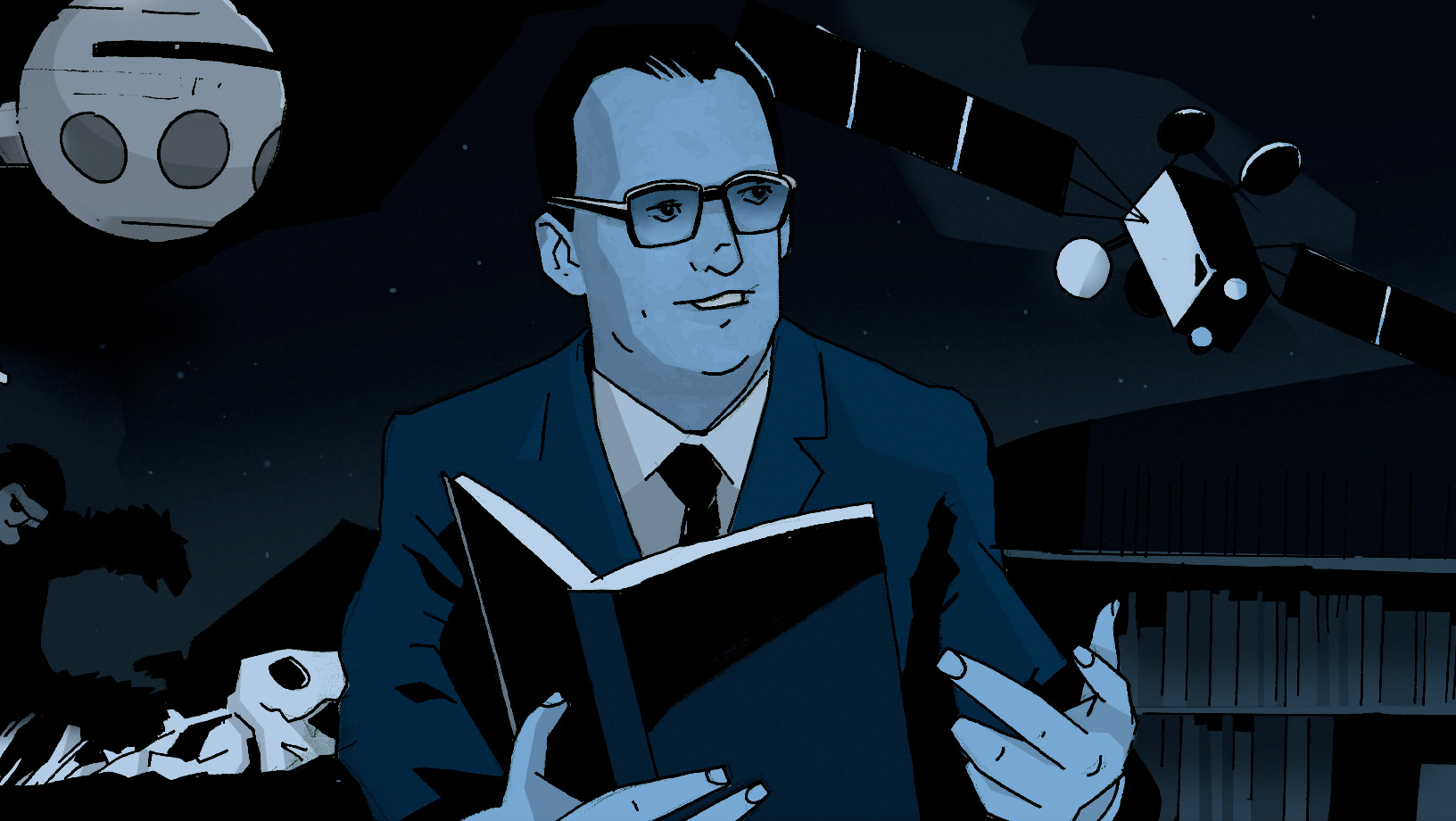
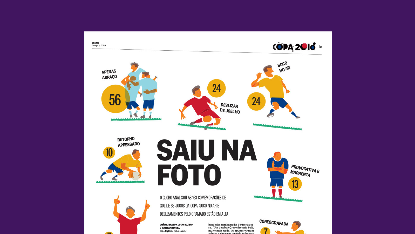
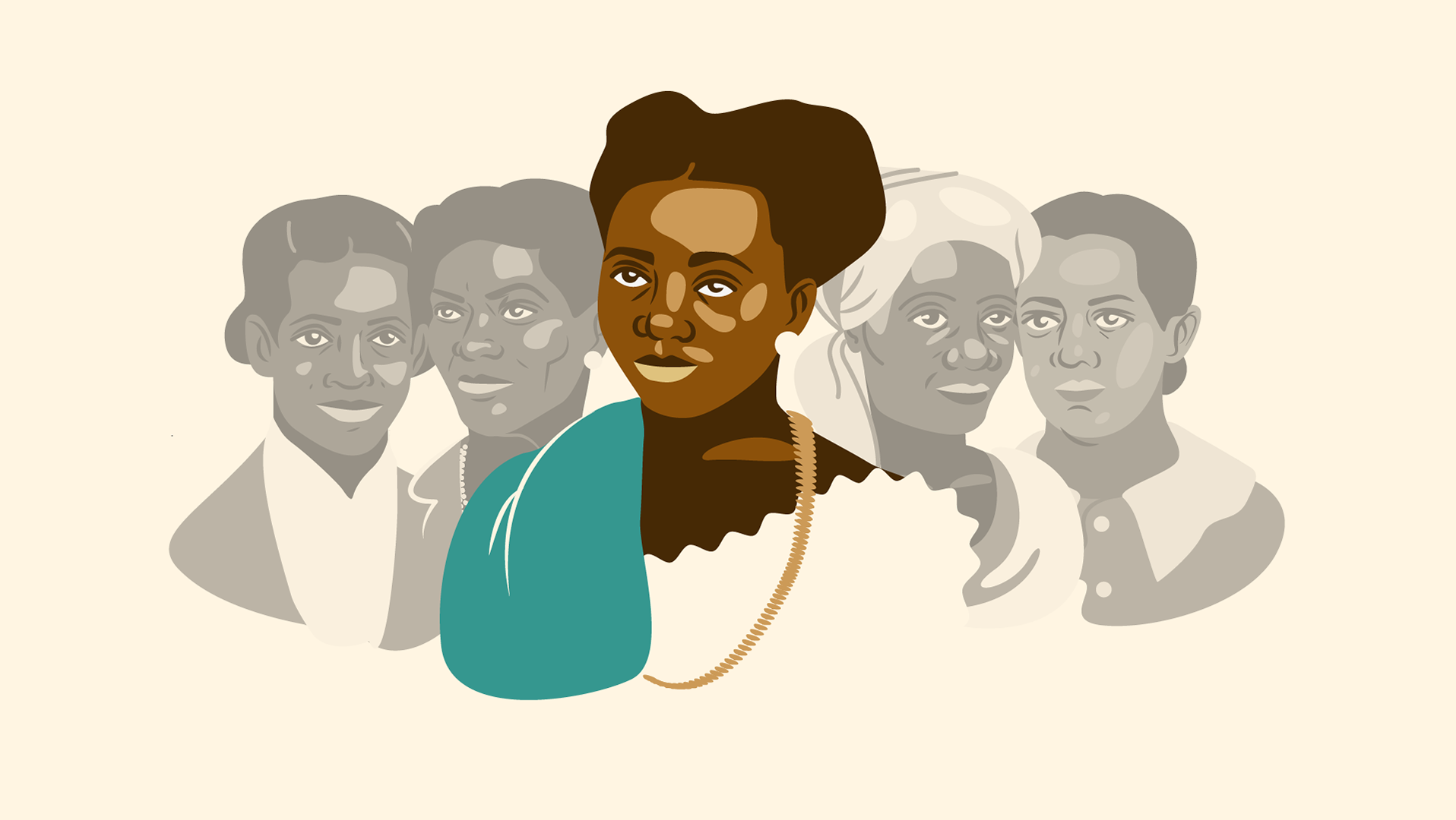
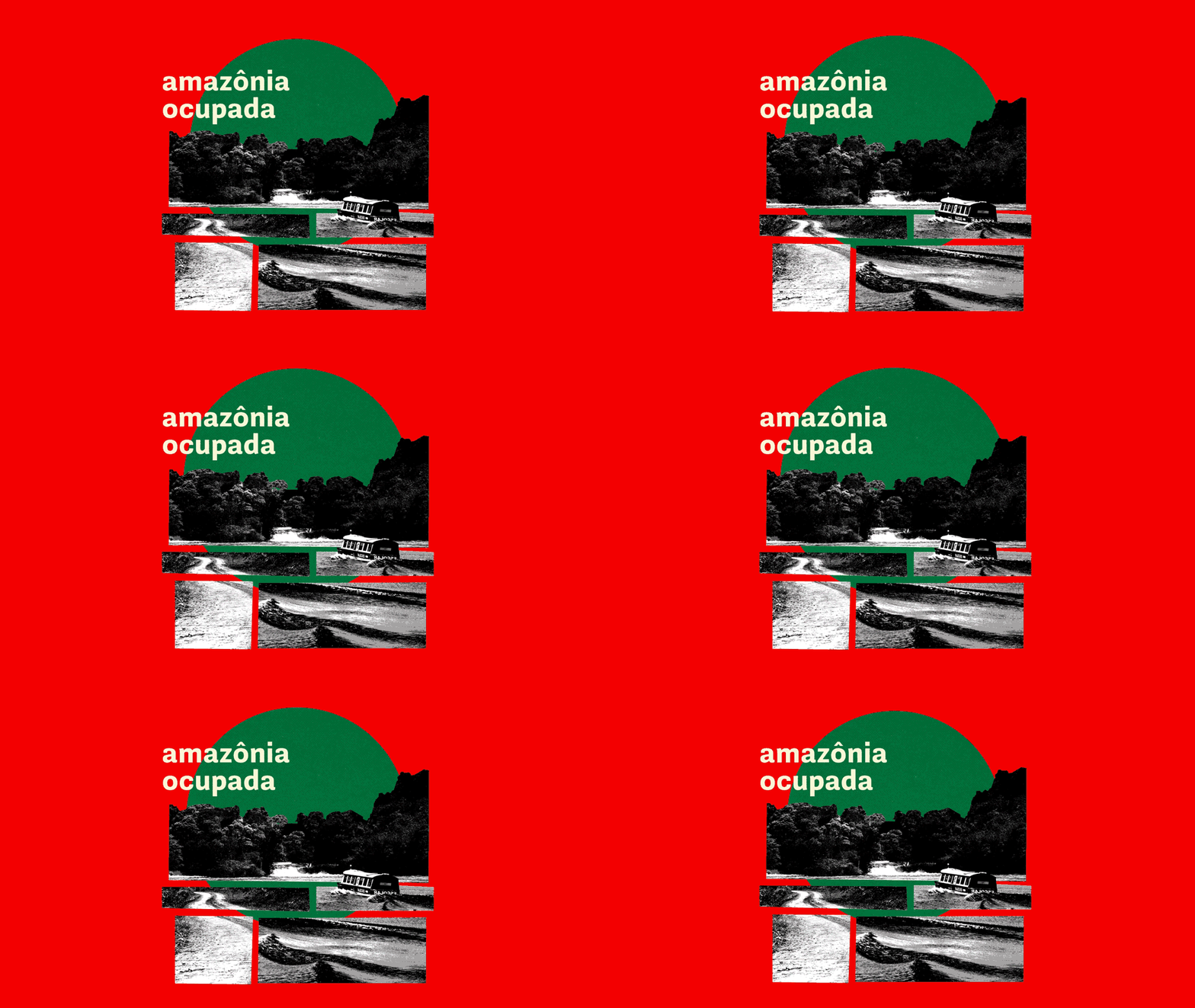
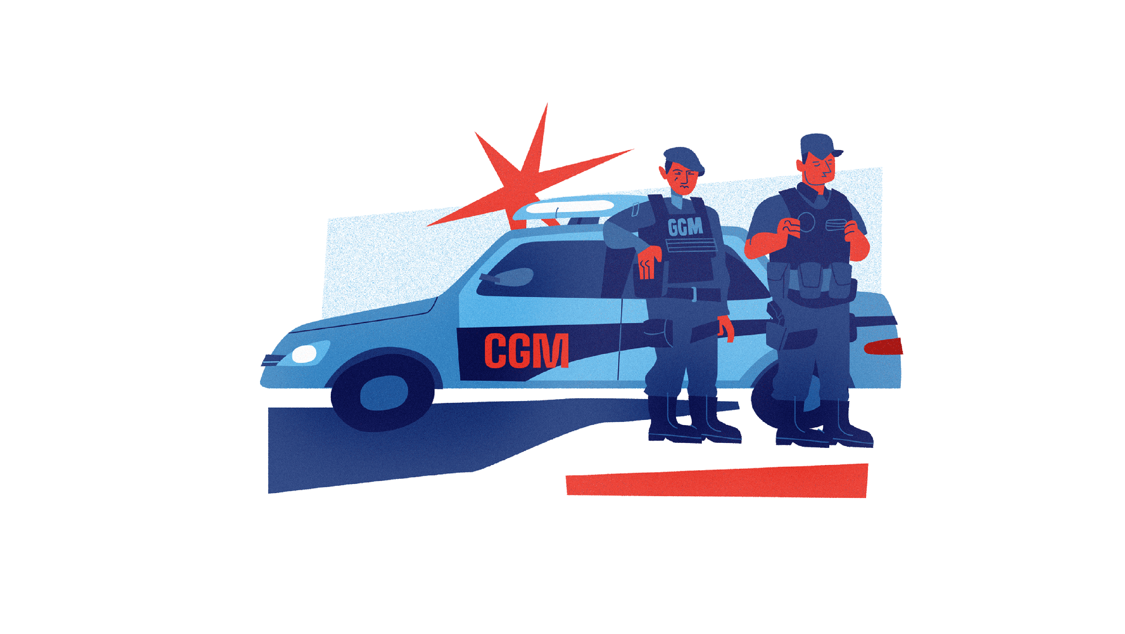
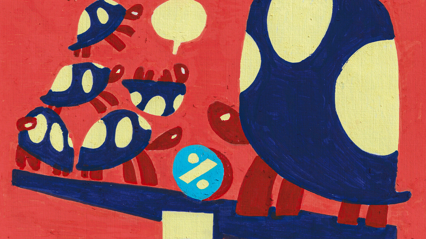
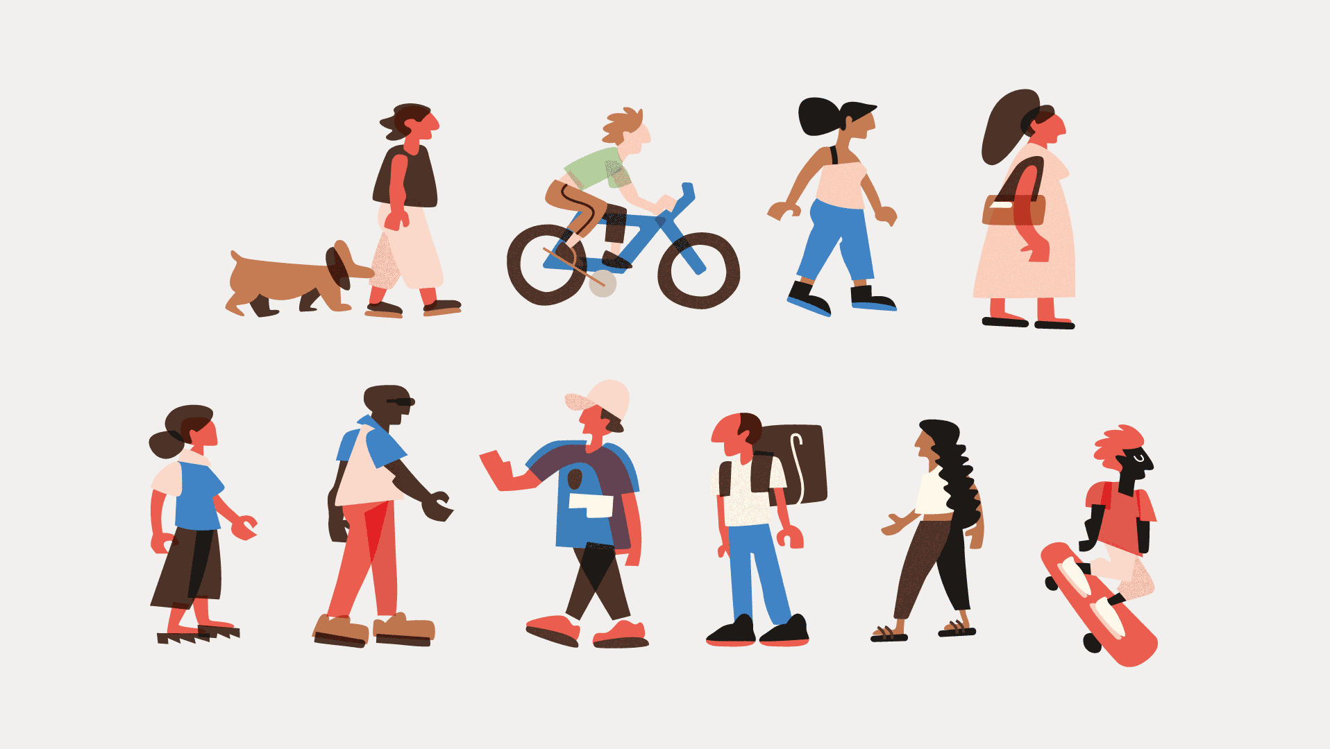
The main challenge of this project was to create sophisticated graphic concepts for the cover illustration. These images address critical reflections on complex issues in the Brazilian economy. The materials were published in both the printed and digital editions of O Globo between October and December 2018.
I listened to the journalists involved in content creation to understand what they wanted to communicate, which was crucial for the project's development. From these idea alignments, the initial cover concept always emerged.
In some cases, the concept needed to be rethought. For instance, a face formed by elements related to infrastructure was replaced by the silhouette of a head, avoiding visual puns with parts of the face.
In some cases, the concept needed to be rethought. For instance, a face formed by elements related to infrastructure was replaced by the silhouette of a head, avoiding visual puns with parts of the face.
The composition
In the printed edition, the white space allowed some elements to extend beyond the margin, created by other elements of the newspaper's cover design. The new, smaller block enabled 'small intrusions' and created an interesting figure-ground relationship with the white elements in the scene.
In the printed edition, the white space allowed some elements to extend beyond the margin, created by other elements of the newspaper's cover design. The new, smaller block enabled 'small intrusions' and created an interesting figure-ground relationship with the white elements in the scene.
About Resources
The digital has different spatial relationships and element sizes compared to print, so it required an adapted graphic design that was still aligned with the printed project. For the digital pieces in this project, some elements had to be redistributed in a new image format.
The digital has different spatial relationships and element sizes compared to print, so it required an adapted graphic design that was still aligned with the printed project. For the digital pieces in this project, some elements had to be redistributed in a new image format.
About the Use of Colors
All of the colors in the illustrations stay within the newspaper's palette, such as the red, which is the same as in the special section. The use of black was strategic and applied at specific moments: to establish contrast between elements or to emphasize figure-ground relationships.
All of the colors in the illustrations stay within the newspaper's palette, such as the red, which is the same as in the special section. The use of black was strategic and applied at specific moments: to establish contrast between elements or to emphasize figure-ground relationships.
Each cover was produced in one to two days, along with small graphics that accompanied the sections. This article on Linkedin (only in Portuguese) provides more details about the process and how this project connects with other areas I work in.
