The challenge
Create and deliver a comprehensive visual identity for JOTA's first event bringing together authorities from all three branches of government, with only twenty days for execution and pending confirmations of authorities and sponsors.
Create and deliver a comprehensive visual identity for JOTA's first event bringing together authorities from all three branches of government, with only twenty days for execution and pending confirmations of authorities and sponsors.
The concept
Develop an integrated visual system that would reflect JOTA's journalistic credibility while incorporating Brazilian modernism elements, creating a bridge between tradition and innovation in institutional communication.
Develop an integrated visual system that would reflect JOTA's journalistic credibility while incorporating Brazilian modernism elements, creating a bridge between tradition and innovation in institutional communication.
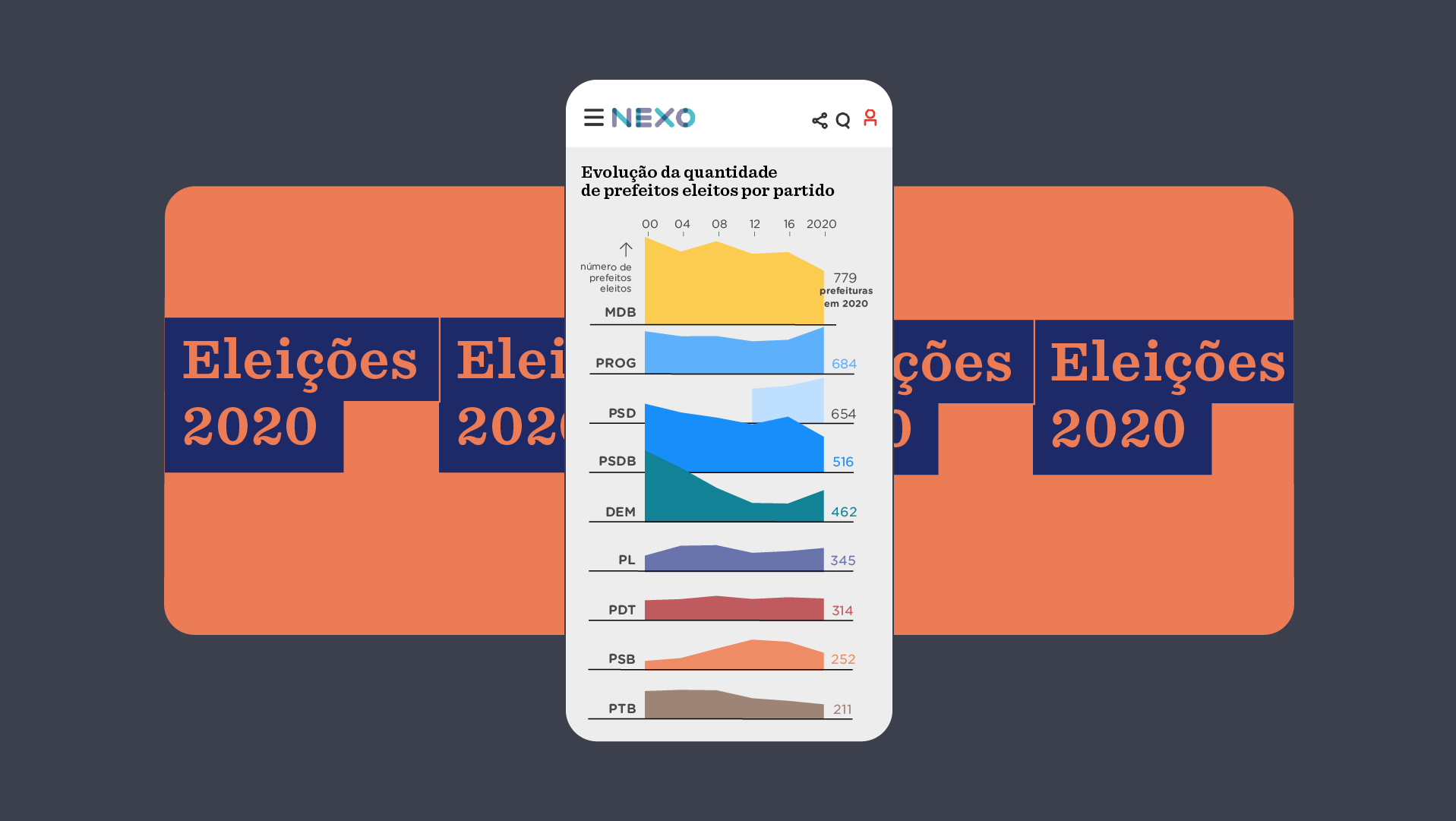
Example of motions used on the event's side panels.
The job
I led the development of a cross-platform visual identity system, working closely with sales and project teams. Key coordination aspects:
> Development of Key Visual (KV) with geometric elements from JOTA's logo
> Integration of Literata typography across all materials
> Motion design task distribution among team members
> Proactive communication system with sales for last-minute changes
> Real-time adjustments for authority confirmations
The results
This approach resulted in timely, high-quality deliveries, even with tight deadlines, client satisfaction, and widespread recognition of JOTA's editorial quality across various media outlets. This project not only met its visual and strategic objectives but also strengthened JOTA's reputation as a reliable source of quality journalism.
This approach resulted in timely, high-quality deliveries, even with tight deadlines, client satisfaction, and widespread recognition of JOTA's editorial quality across various media outlets. This project not only met its visual and strategic objectives but also strengthened JOTA's reputation as a reliable source of quality journalism.
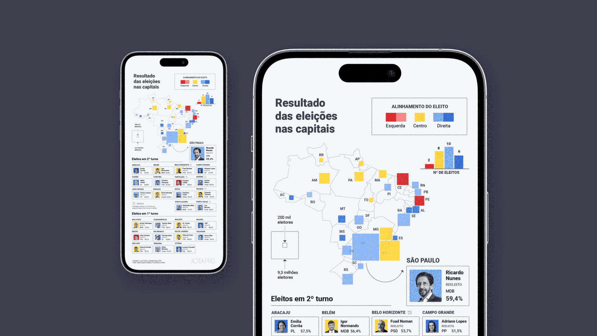
Programming for in-person guests and promotional content on JOTA's website.
Business impact
> Strengthening of JOTA's institutional positioning
> Enhanced credibility with government authorities
> Successful partnership with major tech companies
> Template creation for future institutional events
> Effective departmental integration
Images: Paulo Negreiros and Rômulo Serpa.
Credits
Institutional Director: Bárbara Baião
Institutional Relations specialist: Marcelo Micalli
Project Coordinators: Leticia Paiva and Luís Viviani
Design Coordinator & Senior Designer: Lucas Gomes
Design Intern & Graphics: Chris Moreira
Design Intern & Motion: Ca Aulucci
Institutional Director: Bárbara Baião
Institutional Relations specialist: Marcelo Micalli
Project Coordinators: Leticia Paiva and Luís Viviani
Design Coordinator & Senior Designer: Lucas Gomes
Design Intern & Graphics: Chris Moreira
Design Intern & Motion: Ca Aulucci
